IBM Design System Templates
Maintaining a consistent visual style across the digital landscape is becoming more and more important. To achieve cohesiveness, we have put together visual toolkits for each Systems group to demonstrate components for visual development. The visual toolkits were largely based on the principles of atomic design—a methodology that small, independent – atomic – parts, can be combined into larger molecular structures. The visual toolkits applied to three business units at IBM:
Power Systems
zSystems
Storage Sytems
CLIENT
IBM
OFFICE
Raleigh, NC
TYPE
Design System Templates, Design Strategy, Infographic and Data Illustrations, UI/UX
ROLES
Creative Lead: Ryan Tillet
Senior Art Director: Caroline Schaffer
IA: Rufus Walker
Producer: Stefanie Thompson
File Structure
Before we were able to develop the system we had to take a look at all the components that made social post, display banners and infographics systematic. It started with listing out the needs of each type of asset and identifying the commonalities that carried across asset type.
From there we were able to establish a folder structure where these components would live and provide a diagram in the toolkit for where to reference the assets.
Color Palette and Typography
Based on IBM Northstar color palette and the BU’s branding systems we identified the core colors for design and included additional accent colors to round out the palette. Next we created guidelines for type in order to create a cohesive brand experience.
Iconography
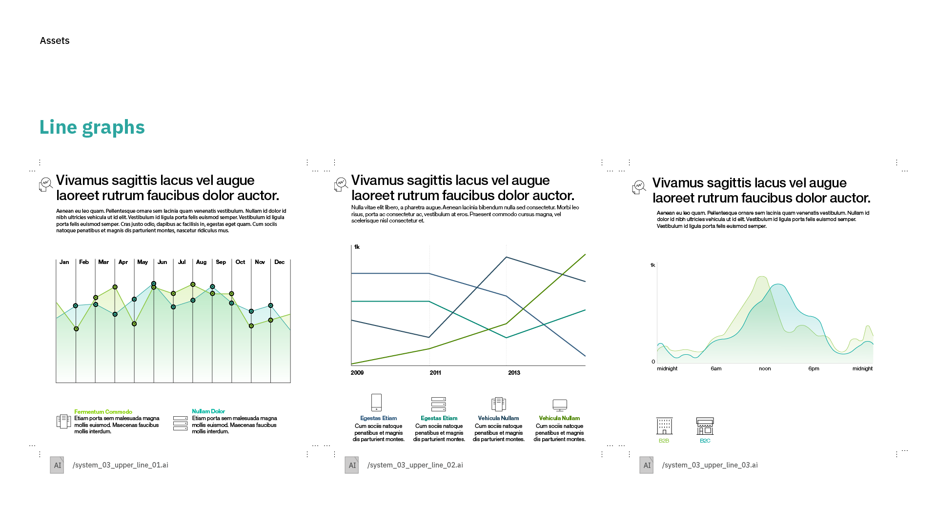
After reviewing the current content in market, we found icons to be a necessity when it came to creating narratives within these assets. We created groups of icon sets that the user could pick between in order to communicate their story. These groups included:
Basics
Communication and Analytics
Industry
Health and Wellness
Home Appliances
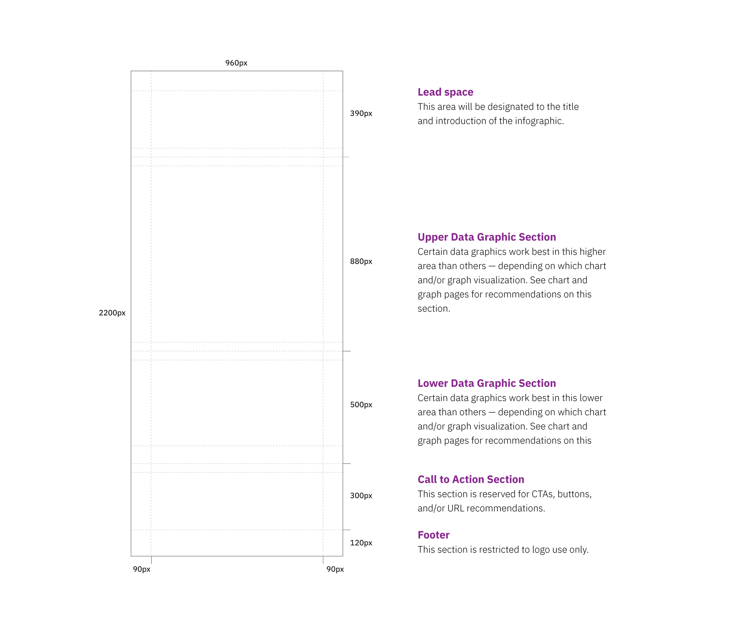
Designate Content Zones
These zones were established to help support consistent structure and establish guidelines for how elements should be positioned within a layout.
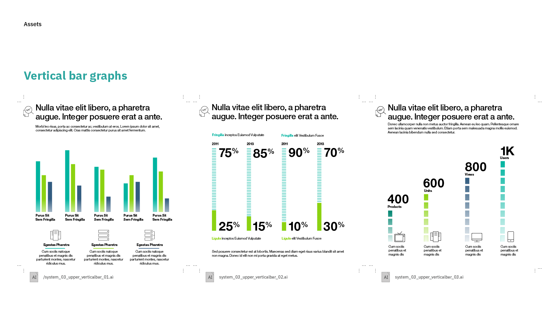
Defining the right content for the right places
After establishing the zones we had to create options depending on background choice and narrative. The different teams were provided three design systems per asset type and each system provided multiple options per asset type.


