The State of Salesforce
In a post-pandemic world, without the in-person conferences. How do you engage with your customers, provide them with information about the future of your business, and give them insight to what is to come?
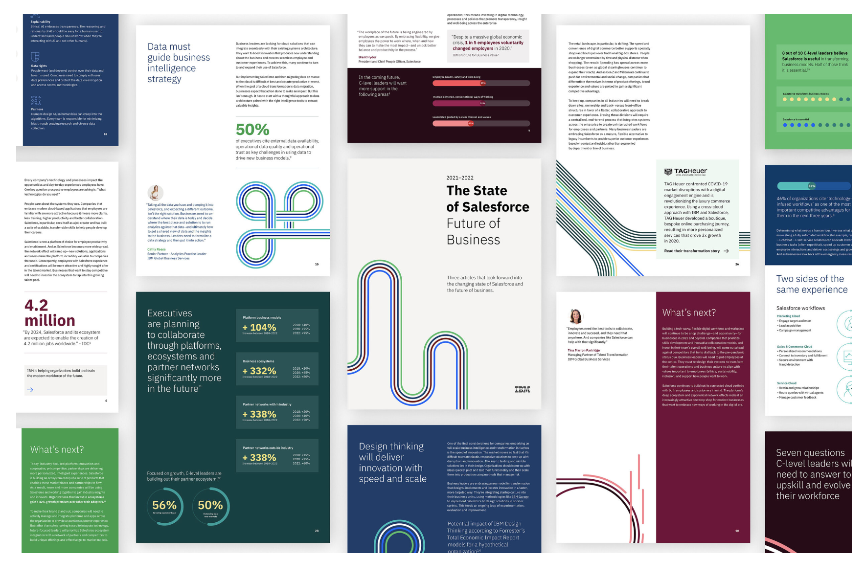
The Bluewolf IBM team, notorious for always having the most decked out booth at Dreamforce (an annual Salesforce event), had to provide the annual report in a different medium this year. Historically, they crafted a beautiful 30-50 page pdf, and since the event was not going on the were distributing it directly. But how could they measure engagement, leads, response rate, open rate, and etc?
Client:
Lindsey Sheldon, IBM Dreamforce
Team:
ACD: Caroline Schaffer
UI/UX: Kenzie Ashley
Motion Graphics: Eric Wilson
Producer: Dolores Palmisano
Account Director: Adam Dannewitz
The Approach
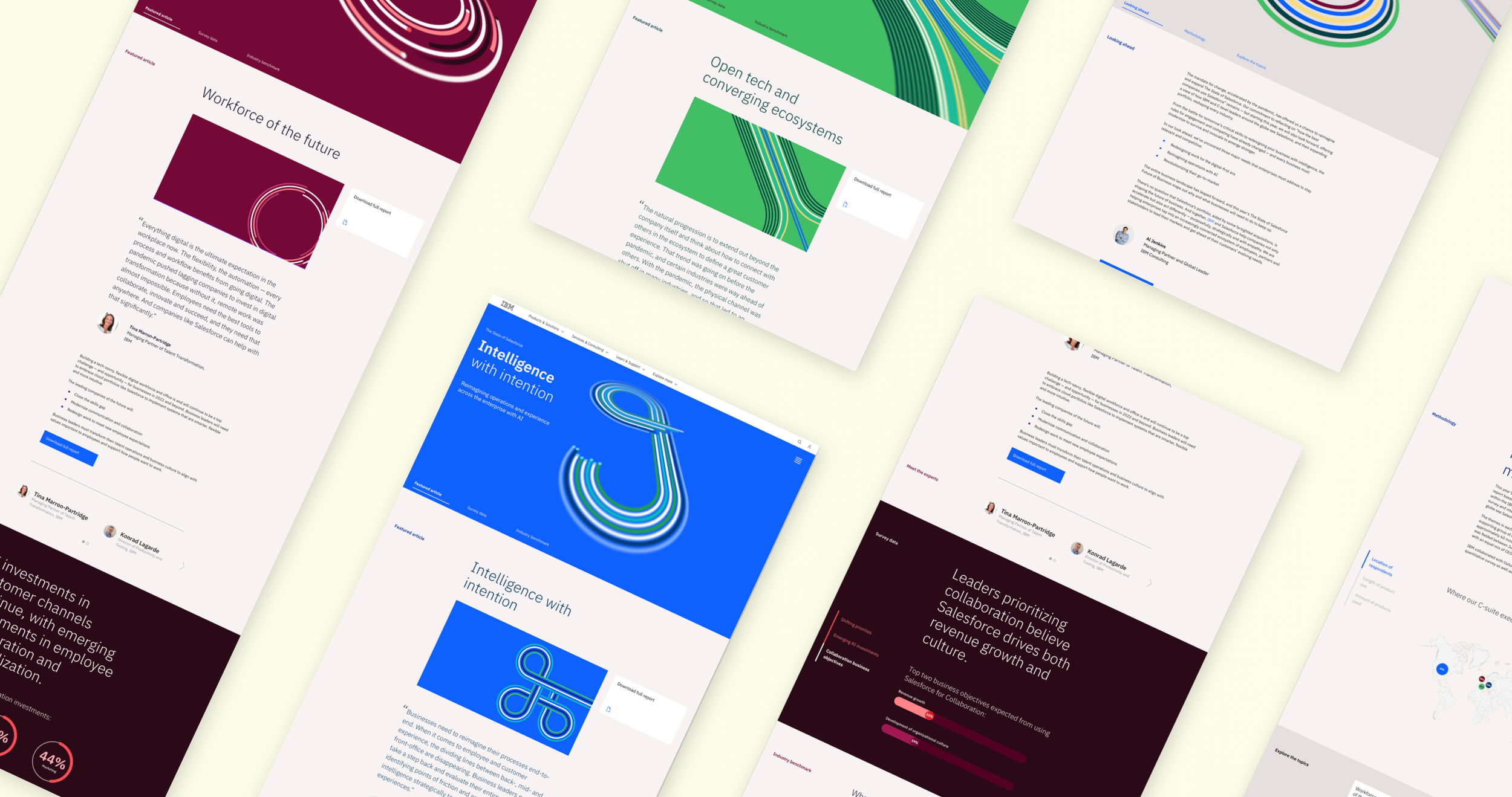
This year, the State of Salesforce would be an experience. This experience would then be able to become evergreen and adaptable to the new years content and trends.
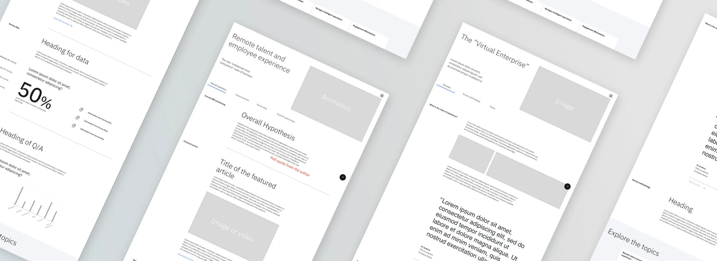
During the UX phase we had to be agile and work under assumption while the Bluewolf team was busy running the reports and gathering data as well as writing the articles for each segement of the report. We worked in parellel and built out wireframes with Carbon components and elements in mind:
There are three sections of the State of Salesforce Report (Themes)
We needed a hub with navigation to get the user to each theme
Each theme had a featured article that supported the trend along with survey data
We proposed to incorporate user generated data for engagement on the experience (This allowed users to see where they stack up against the survey data and reporting from sample size taken)
We wanted a section to feature authors of the articles
The experience needed to explain what the purpose of the report was and the methodology behind it
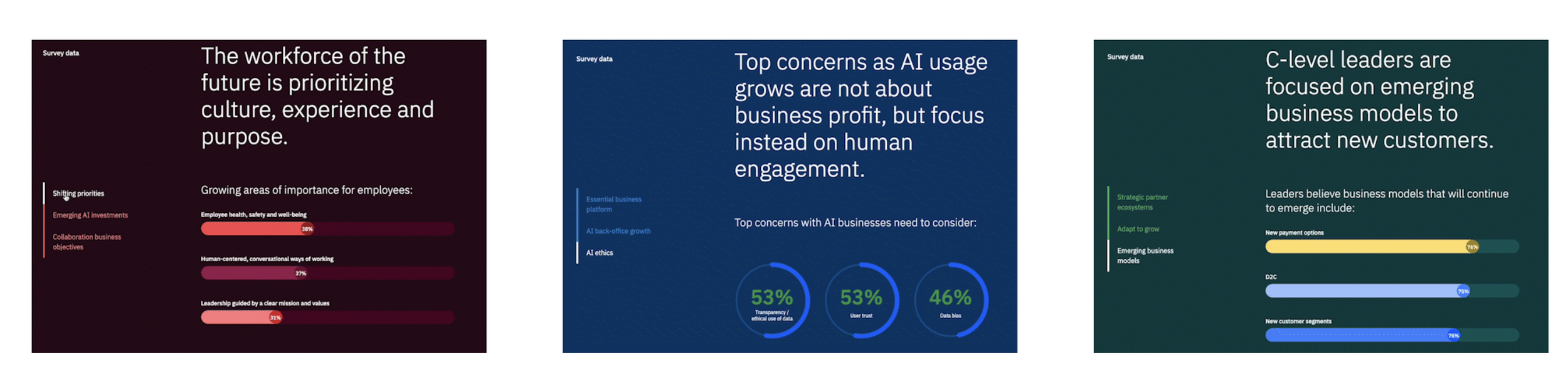
The Content Themes
In order to establish a clear separation between subject matter while laddering up to the brand language we create distinct design elements and leverage a ownable color palette to communicate our stories. These all came together in a downloable PDF that IBM could now track as well as gate to gain more qualified leads.

Intelligence with intention

Workforce of the future

Open tech and converging systems
Motion Studies
Leveraging IBM design philosophy, we created our approach to animation guided by two essential types of motion: productive and expressive. The distinct impression created by each type offers a clear means of creating contrast, but also a sense of cooperation—man and machine, organic and engineered.
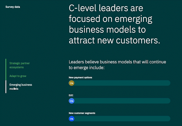
Data Visualizations
Another solution incorporated to further the experience was to utilize the data presented within the report as a means to bring in more animation. Through incorporating IBM Carbon Design System motion studies, we were able to create visually interesting, interactive data visualizations.
Fully Trackable Reports
By gating the robust downloadable report, we are able to measure engagement and conversions from site to leads. This also will help the IBM team enable some test and learn analysis to see if the report is as effective as the website.